Thursday, November 3, 2011

art, wine, and chocolate festival

Last month we set up a booth to show people that yes, anyone can paint.  And that the point of it is to have fun!  Two wonderful friends helped us demonstrate just how this happens.  I took photos, and decided to share them here.  You can see Denise and Suzy smiling, and concentrating as they paint, deep in thought as people pass by looking.  They shared their views on painting while they sat, and quite a few people stopped and asked questions.

It was a great day, my sisters and I were all together, and while I painted and Vicky explained to passersby, Dooj fetched our wine (we were lucky enough to be right across from the wine booths!), and Stevie Wonder fetched us chocolate, nuts, and all manner of yummy fare.  It was sheer heaven for me.  Great music, art, wine and chocolate!  What better combination is there?  If you are in Suisun City, California during the first Saturday of October next year, stop by and sample the wonderful wines, and locally made chocolate and art to be discovered and purchased.  You'll be glad you did!
~cath xo


Tuesday, October 4, 2011

between places

Today I am spending most of my time in the air. Since it is hard to type and make any sense trying to blog on an iPhone, I will share some of the last photos I took today before I left Sacramento.

(I am discovering that being caught in midair between destinations is not very conducive to meeting the requirements of this blog challenge I have accepted.)

Thursday, September 8, 2011

sea oats are easier than videos

A few weeks ago, we spent a weekend at the beach.  I took Big Girl with me, thinking to capture photos that would wow the world.  That didn't happen.  I tried, but my camera karma (say that real fast 3 times) was working against me.  By the time I found the perfect place to take photos, the sun was setting and they wouldn't let us through the gate (it was a state park).  I was so disappointed.  For about 5 minutes.  Then I remembered I got a few shots on my iPhone with a nifty little app I love called the Hipstamatic.  So all was not lost.

I posted some of the photos on Flickr, and as I looked at a particular one, I decided I wanted to adapt it to canvas.  I had been thinking about sea oats for a bit.  And just happened to snap this on my way from a day at the beach:
They aren't really easy to see, but they are there.  I decided I liked the monochromatic look of the photo, so the gears in my brain started whirling and I decided to try that effect in paint.  I didn't want black and white, so I chose brown and white paint.  THEN I decided I was going to try to video as I went along, and post the video on this blog.

EPIC FAIL.  I have a notoriously slow Internet connection.  I had 9 little videos to upload, most less than 1 minutes each, and every time I tried, I got to number 5 and it wouldn't cooperate.  I was grinding my teeth in frustration.  I love tech stuff, but this was ridiculous.  I had posted on the Facebook page the fact I was going to post on the blog page (never promise something before you discover if it is achievable).  

Then I discovered YouTube.  I mean, I didn't discover it.  I've been playing YouTube videos for eons and sharing them on Facebook.  But I discovered that what my computer was spitting back at me and refusing to upload, YouTube did quite nicely.

So this whole experience has become a lesson in discovery:
1. my iPhone takes pretty darn good photos
2. painting with just 2 colors of paint can be done
3. YouTube has perfected the art of uploading videos so I don't have to
4. don't narrate off camera with a paintbrush in your mouth

So here are my few moments of YouTube fame.  This is also the second video I ever made and posted on a blog (you can read about my first experience here, before I learned you can also combine short videos into one video).  So don't be too critical, but I'd appreciate hearing your thoughts on my attempt at channeling Bob Rossi. :)


~cath xo 

Monday, July 4, 2011

slick as glass

In the south, if something is slippery, hard to hold or stand on, we say it is slick as glass.  Today I decided to try my hand at painting on glass.  And I learned just exactly how slick glass is.

I bought a test kit, one of those do it yourself starter kits, because the one thing I have learned when testing new paint is: DON'T WASTE MONEY ON SOMETHING YOU MIGHT NOT USE.  I say that with emphasis because I have wasted lots of money over the years on art supplies I didn't use.  So my advice to anyone who wants to try a new medium to paint in, buy a kit first.  

After I bought the kit, I chunked the cheap brushes in the kit to the side for the kids to paint with.  That is something else I learned: buy good brushes.  By good I don't necessarily mean expensive.  When I buy brushes, I buy them in the store, with my hand on them to see how they look and feel.  Personally, I don't like bristle brushes of any kind.  I prefer sable for water color, enamel, and oil painting, and I like the acrylic taklon type brushes for acrylic paints, and they also work for just about any other paint I use.  I shoot for medium price range, and look at the ferrule (that shiny metal thing that holds the bristles to the handle) to make sure it is constructed well.

Ok, so enough of the advice.  Now how does it feel to paint on glass?  SLICK.  As in it slides off the glass if you stroke too much or too hard.  I learned quickly it is all about loading your brush with paint.  Not too much and not too little.  Too much and you leave a glob of paint.  Too little and it is transparent.  That doesn't mean mine turned out perfect...there are spots you will see where there is a bit of a ridge in the paint, or it is a bit transparent.  But the overall effect was achieved I think, and it was fun doing it.  
I liked the feel of the paint gliding onto the glass, after I made a few strokes.  I painted on a cheap glass container I bought when I bought the kit, and I also painted on a glass I had gotten at one of my favorite Alabama wineries on one of our tasting trips around the state.                                                                  
The paint dries quickly, and you have to paint one whole flower at the same time, or it gets sticky and does funky stuff.  If you want to lay one color on top of another color, you have to let the first layer dry.  You don't have to paint FAST, you just have to plan what you are going to paint before you start putting the paint on, or is gets a bit tricky.  After about 3 flowers, I kind of had the hang of it.  I put the stems and leaves on first, and then added the blossoms. 
You can mix colors, but mix small amounts, because again, it dries fast.  You can add water but be cautious because too much and the paint is too thin.  This is how I feel about adding anything to a paint like this that has a certain viscosity: when you add water, you break down the chemical make up of the original paint, which means it might not have the "strength" to stand up to even mild wear and tear.  Stick with the paint in its original form.  Just because a paint says "water-based" doesn't mean it loves being thinned with water. 
The directions say to let it air dry before using for about 19 days or so.  Or fire it in a low temp oven, and because I am the patient, perfectionist type, I am going to fire those babies just to see if they break.  That is one of the fun things about learning a new technique.  I get to break stuff or destroy it and not feel guilty, because I am learning.  It gives me a certain sense of freedom.  So I wait for the paint to dry a day, then in the oven they go.   
If they turn out, you won't hear anything else from me.  Because I will be drinking my wine from my new, decorated wineglass.  

If you see me drinking from a Dixie cup, don't ask.  Just don't ask. 

Have fun and Let's Paint!
~cath xo


Wednesday, June 15, 2011

lolling on the beach

For me, painting a beach is the next best thing to being there.  Sounds crazy?  Maybe.  But as I paint, I picture the place I am painting in my mind.  It helps me to create, yes, but it also evokes an emotion.  And all this together is a way to relax.  I never get so wound up in the technical aspects of painting that I lose that image.

You will find, as you paint, and paint, and paint some more, that you will become comfortable with mixing paint, and what sizes and types of brushes to use, what size to make the painting, and so on.

Once you reach that point, begin to try to keep a mental image of what you are painting.  Close your eyes and think about it.

For me, I could hear the waves rolling into the beach.  I heard the cacophony of the gulls overhead.  The wind was blowing the clouds by, and rustling the leaves of the palm tree I was sitting under.  And the sun was blazing down on the sand, warming it under my feet.  I could smell the salt air, and a total feeling of peace and quiet took over my mind.

And I put all those thoughts into the brush that laid the paint down.

Landscapes are so...therapeutic.  Hope you have a chance to lay on a beach like broccoli this summer.  I plan to.....with a good book and a margarita in hand.

Have fun!  Enjoy the hazy, lazy, crazy days of summer.

Too soon, they come to an end.....

Saturday, June 11, 2011

flamingo road repaved


We teach our budding artists at the studio that there is more than one way to skin a cat.  Or more specifically, one painting can be interpreted thousands of different ways.  This is because we are each unique humans with our own way of seeing and being.  No two paintings will ever be completely alike.  This is the fun of painting.  The surprise of the creation.  

My last post was of a flamingo, gorgeously photographed and posted on JP Brandano's Photography blog.  (You can find his blog here.)

As I read the comments on the first post, I saw that Eileen from Ferocious Introvert had mentioned the red in the painting made her swoon, and that she liked the description of the steps to create the flamingo, and what I used.  I thought about that comment for a while.  Swoon?  Did that mean she doesn't like red?  There was too much red?  It was too intense?  I was really kind of confused.  But after I chewed on it for a while, I decided two things:
1. I am always going to use Big Girl to photograph my paintings for this blog.  Mainly because using artsy photo apps on my iPhone may look snazzy, but it changes the colors in the painting from what they truly are.  What I end up with is an artsy photo of an artsy looking painting.  Too much artsy fartsy.
2. I wanted to do the flamingo in different colors.  To see what would happen with the feel of it.

So, this morning, I grabbed my paintbrush and Big Girl and started painting and shooting.  And what you see below is the result.  I hang my extra paintings, or paintings I like, at work in my office.  They are ice breakers with my mental health clients, and they turn a drab office into a room awash in stimulating color.

So thanks for your photograph Jim, x2.  I love that photo!  And thanks for making me stop and think Eileen, and go in a bit of a different direction.   Every day is a day to learn something new!

~cath xo


my palette, cool colors this time

outlining the design (an oops on the beak!) :D

filling in the leaves

close up of Brandano Flamingo

closeup of leaves, using dabs and swirls of green, yellow and red (yes, red!)

about halfway finished

pinks and whites of the flamingo plumage

closeup of flamingo

closeup of finished flamingo in pinks


voila!
Check out the links on the blogs I mentioned...they are great reading!

Sunday, June 5, 2011

flamingo road

As an artist, sometimes the best ideas come when you least expect them...and for me ideas often happen when I am poking around on the internet.

That's right.  I get ideas by looking at and reading the ideas of others. When I paint, I often paint from a photo.  I am not a "plein air" sort of painter...I have to have time to think about what I am painting, how I want to change and adapt it to my style.  Everyone has a style.  I used to think that my style was having no style, but I realize now, after years of painting, that what we see with our eyes comes through our fingertips to the media we are using, via our brain, and we all have unique one-of-a-kindness when it comes to the old noggin.

A week or so ago I was reading blogs.  I follow many really good blogs, and many of those are photographers and artists (where to better get inspiration than from other artists?).  So as I am reading one blog and scrolling through some gorgeous photos, BAM! I see it...a photo of a flamingo that is so bright and perfect it jumps right off the monitor and zaps me between the eyes.  This particular flamingo belongs to Jim Brandano.  His blog is JP Brandano: Florida's Photographers and you can see the flamingo that set my creative fires alight by clicking here.

I messaged Jim on Facebook to ask him if it would be ok to use a photo of the flamingo to paint as a sample for the studio's classes next month, and he very kindly agreed.

I started with a watercolor sketch of the flamingo.  I do a lot of paintings in watercolor first, to get the feel of the subject, and to see how long it will take to paint.  Because our classes are 3 hours long, it has to be simple in subject, and easy enough that anyone can paint.  I sketch in the main parts with a pencil (that isn't cheating, it's called blocking in).

With most paintings, we tell the class to start with the background first.  With watercolor, I did just the opposite.  I filled in the foreground first and then added the background.  I used a dry brush technique (this means the paper is dry) because I didn't want bleeding to occur with the paint.  (If I wanted to  blend an area, I dampen that area.)  I worked it up in shades, adding color and blending, then working on the background.

 After I was happy with the way it looked, I decided it needed outlining in black for detail.  I used my Pitt Pens for that.  


I thought I was finished with the watercolor at this point, but I looked at it a couple days then decided to get some acrylic paint and goober it up a little more.  (That's a real artsy fartsy term, but that was what I was afraid I would end up doing...but since I wasn't satisfied with it, there was no way to go but forward...GUNG HO!)


Here I go with the white acrylic paint...just jumpin' in with both feet.  (That's my worktable...not real fancy or neat, but very user friendly.)


Finally I am SO done with it and ready to move on.  To canvas and acrylic paint. 

The next steps pretty well speak for themselves so at this point I will shut up and let you look...if you have any comments or questions, please feel free.  I live to try to explain how my brain works with an idea. 


Hope this gives you a better idea of where to go for ideas.  Basically, that would be whatever is in front of your eyeballs, and makes your fingers itch to take up paintbrush and lay paint to canvas (or paper).  Give it a whirl...it's fun to step outside that box and try something different.

For me?  Outside the box is trying to tame Big Girl into submission so I can capture the moments of my life, then paint them.  She's an ornery girl...but so am I.  :D

photo taken by Big Girl :D
 
Thanks again to Jim Brandano of JP Brandano Photography for inspiring me this month.  Check out his blog for some wonderful photographs and great tips on photography!


Thursday, April 21, 2011

a monet moment

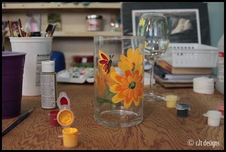
Last week I painted the samples for our May studio classes.  I took photos of the Monet I painted so I could share them with you here.  (I know you all have just been itchin' to see another painting step by step) (:

Then my Internet connection crashed and I was left with everything in limbo for nine long days.  So I spent my time working on some other art projects, and of course my photography kept me busy until the technician finally showed up after a delay from some thunderstorm and tornado activity here in the heart of Dixie.

The Internet is back now and working, so let's paint!

Monet was a wonderful Impressionist master.  His paintings are well recognized by most people, especially his water lilies.  Monet painted LOTS of water lilies, in all colors of the spectrum.  For me, the uniqueness of his work is seen in the softness of his brush strokes.  When you look at Monet's work, you can interpret and envision all sorts of things in the blended colors.  That is what makes Monet's paintings so recognizable; they evoke emotion.  You look at his work and can almost feel the emotions he felt as he painted.  The lovely thing about Impressionism is that it leaves detail out, so you can see the pure colors and feel the emotions in your own way.  That was the brilliance of the Impressionist artists.  And why Impressionist art is still well loved by almost everyone who looks at it today.

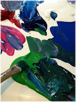
Today I chose a warmer palette than Monet used.  I started with cobalt blue, bright green, white, black and fuchsia (magenta).  When I interpret artwork from one of the masters, I also print out the painting I am trying to capture, for reference.  My aim is not to copy, but to capture the essence of the artist.  My brushes today: #6 round, 1/2 inch flat wash or bright, and a 3/4 inch flat wash/bright.  I used mostly the #6 round and 1/2 inch flat wash, using the larger brush just for the first background blocking in.


Step 1- I make a rough outline in cobalt thinned with a bit of water of the areas of the lily pads.  This blocks in the placement for me.


Step 2- I start blending blue and white, laying in the water, using short brush strokes and being careful not to blend too much, or the shades and nuances of blue will turn to mud.


I continue with the background, adding magenta to the blue, along with white, to create a lavender mauve.  I stroke this into the bottom right corner.
Step 3- I work the right upper corner in with more magenta and a lot of white.  If you look at the original, you see what looks like a glop of light pink paint in the right upper corner.  I couldn't figure out why Monet would add that bit of jarring color to the top corner like that, and finally decided as I gazed at it, that it was a reflection from a bridge of either clouds or people.  I even thought it might be Monet sneaking a bit of a self portrait into the painting. 


Step 4- About this time I look at my palette.  I am not happy with the shades of blue, and feel it needs a warmer tone added, so I plop some phthalo (pronounced "thay-lo") onto my palette.  You can see the difference in shades of blue.  (The phthalo is in the middle, above the cobalt blue.)  Then I start to blend the blues with white and magenta and add the color back into the background. 


Step 5- I start adding lily pads.  This is where the fun begins for me, because I can let my creativity run rampant, and place those lily pads any old place I choose to.  I blend the blues with the bright green, because I don't want those lily pads looking like they will glow in the dark!  I make a flattened circle with a lighter shade of green, and add a bit of blue to some and a bit of white to others.  The reason I do this?  Because if I paint all those flat as a pancake circles the same green, it would end up looking like one big lily pad.   No depth, no dimension.

Step 6- After I add the lily pads, I begin to add darker green to the edges to give more dimension and definition.  Now I don't grab that paintbrush and start drawing circles around every lily pad, for the same reason I didn't shade every lily pad the same green.  This is where I start planning the placement of the lilies, adding green darkened with black to spots on the water and lily pads, where the shadows beneath the lilies will be.


Step 7- I throw some cadmium red deep onto the palette and add a bit of magenta to some of the red, then throw those lilies on that canvas.  Be careful, stop and look at the painting from about 4 feet away after every lily or two, or you will have it looking like a runaway rose bush with blooms all over the place.  Lilies are subtle, they bloom here and there, and have space around them.  The object is to make it look as it does in nature, random and beautiful.  When I finish the red, I start adding dabs of white and pink, to give the lilies depth.  Again, I am not doing paint by number, this painting has to have dimension with color because if not, it will look like one dimensional, flat and lifeless.

Notice those areas of dark green/black?  I added the lilies on top of them, and guess what?  They now look anchored to the pad or water, instead of floating in the air.


Step 8- Almost finished, I keep adding a little blue back to the water, and a little touch to the lily pads, and lilies, using the #6 round brush for the "detail" work.  I have to stop and look at it frequently, because I want the water to look as though there are trees reflected in it.


Finally I decide I am satisfied with the effect I want to achieve, and I sign my initials in the lower right corner.
I hope you have enjoyed this little demonstration/instruction.  Monet is very relaxing for me to paint, because there is no wrong way to do it.  It is my interpretation, and my work.  Monet painted in oils, and painting in acrylics to achieve the same effect was an enjoyable challenge for me. 

Vicky and I will be offering the Monet Red Lilies on our May calendar.  If you want to spend 3 hours relaxing in a fun atmosphere, I hope you will give Vicky a call and book a class.  Painting is food for the soul, and everyone CAN paint.  And we will show you how.  (And be sure to bring your favorite beverage...mine is wine!)  You can get the details on our website by clicking here and going to the calendar page. 

Have fun and LET'S PAINT!
~cath
(You can follow us on Twitter @TreasuresBy_You, and like our Facebook Fan Page at Treasures by You!)